Memo on the new EnticEdge branding
COMPANY UPDATE
As you may have noticed, EnticEdge’s branding has had a bit of a refresh, refocus, and redesign! We could not be happier with the results, and we’d love to share a little bit more behind the scenes with you about the process, and meaning of our new brand identity!
As with all things, we started by referring back to our own internal Cornerpiece® where we were reminded of our mission statement and our company values. We used these as a benchmark throughout the rebranding process to keep our visual messaging aligned, and to avoid any personal preferences from clouding our decision-making.
EnticEdge Mission Statement:
Our mission is to help companies articulate their value and grow their business.
EnticEdge Values:
Simplicity with impact
Innovation and creativity at all levels
Hands-on, team-forward approach
Kindness and empathy
With this foundation laid, we worked with Milwaukee, WI, based designer Sydney Michuda of Super Creative to create the new brand identity. P.S. We should also add here that having our Cornerpiece® on hand also allowed us to fill out the design questionnaire from Super Creative much more efficiently since we didn’t have to start from scratch, and our whole team was already aligned on our key messaging and purpose.
We couldn’t recommend Sydney enough, and one of the things that most impressed us was how quickly she seemed to truly understand our company mission, personality, and goals. Below is the design memo that she attached with our now logo:
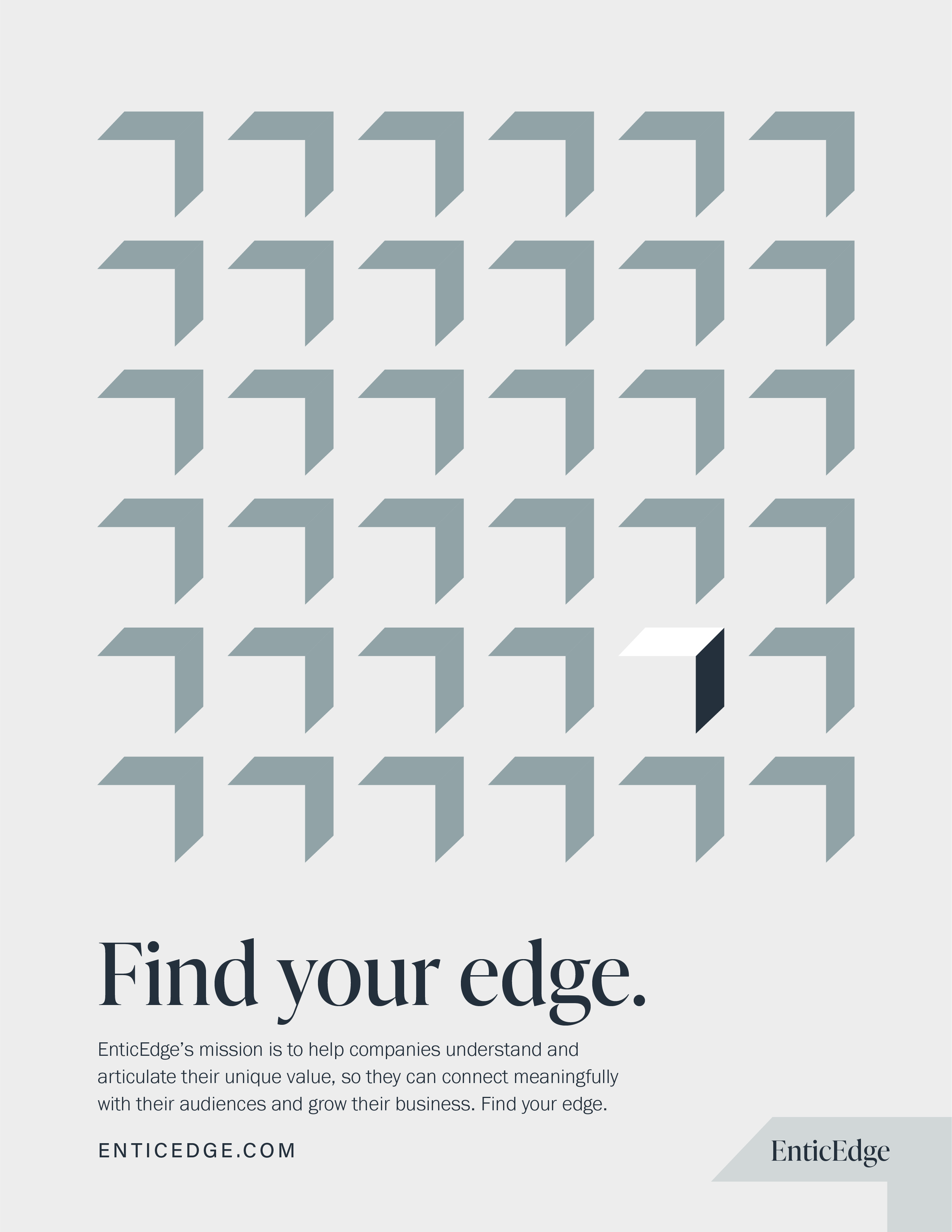
“This symbol doubles as an upward pointed arrow (representing the upward trajectory of the client’s business), and the top and side faces of a 3D box (leaving the front face of the box as negative space). This provides the notion that EnticEdge will think outside the box and look beyond traditional solutions. Lastly, the icon creates a corner which speaks to the brand’s main product, Cornerpiece®. From the icon, other brand elements were created. The main font is a serif which provides an elegant, timeless touch and appropriately leans away from the overdone tech aesthetic. This font style mixed with the crisp icon strikes a perfect balance between classic and modern. The color palette reads as professional, experienced, and current. Overall, direction 01 is sharp, sophisticated, and trustworthy.
We’re so excited to have started the next chapter in EnticEdge’s history with our updated brand identity, and we’re even more excited to share it with our wonderful clients and all of you reading this.
Our very best,
The EnticEdge Team