Why Your Company’s Online Presence Should be Accessible & Where to Start
Most companies’ outreach and services are found online. Through ads, social media, and websites, companies share their purpose. Now imagine if a fourth of your target audience can’t access your content. They can’t read your mission statement or navigate to sign up for your services. About 25% of the U.S. adult population has a disability, some permanent and others temporary. These include visual impairment, hard of hearing, mobility restrictions, and neurological disability. It’s important that everyone has equal access to the information across the web, including that of your company.
How Accessibility Can Help You
In addition to the benefit of digital accessibility for those that rely on it, having an accessible platform can help your business grow!
Increase your client pool! Many companies are at risk of losing out on possible business due to inaccessible websites. Creating accessible content allows for a greater range of people to explore your website and potentially become loyal customers.
Effectively share your purpose! If users have a difficult time navigating, reading, or understanding your content, they may miss out on knowing your value and all of the great things your company offers. An understood purpose helps build your customer base, brand, and sales!
It's cool to be inclusive! Inclusivity should be a prioritized component of your brand through your content and how your content is delivered. Inclusive brands are more respected and favored!
Improve SEO ranking! SEO ranking is your website’s search engine optimization ranking. This indicates your website’s position on search engine results pages as people are surfing the web. SEO algorithms can interpret accessible sites more efficiently and accurately, ultimately improving their ranking.
Inaccessibility can be illegal! There can be ramifications if digital accessibility is ignored. Web content is required to be ADA compliant by the American Disability Act which means that accommodations must exist to make it accessible to everyone. Lawsuits for web accessibility are at an all time high with over 3 thousand filed in 2022.
Where to start
When accessibility isn’t accounted for from the start, it can feel like an intimidating task to make your website accessible. Digital Accessibility doesn’t have to be scary or difficult. There are many simple practices that you can start now that could drastically improve the accessibility of your page.
Alternative Text
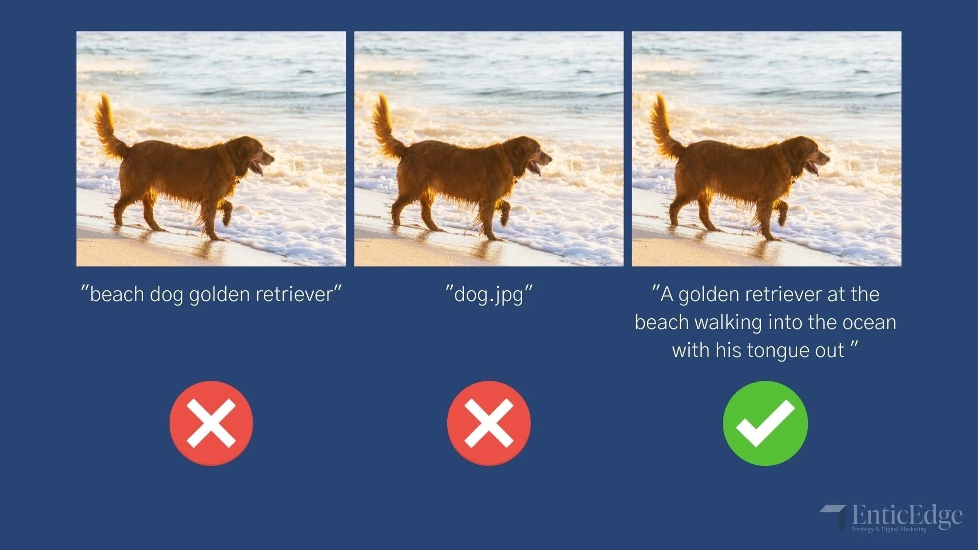
For individuals who use screen readers or cannot view images online, alternative text is essential. Alt-text lives in the metadata of an image and is meant to describe the contents of a visual for someone who can not see it themselves. Good alt-text provides a meaningful description that conveys the necessary content. Alt-text including the file name or a list of keywords is ineffective. Images can be vital to understanding the content of a page, so it is important that everyone is able to experience them in some way.
Meaningful Links
Another often overlooked practice is having effective link titles that describe the purpose of links. Commonly used poor link titles include pasting the link’s web address or labeling it “Click here”. Although links may be surrounded by text that explains its purpose, for assistive technology (AT) users, the link may not always be accompanied by that text. The links of a page can be presented as a list of links which is helpful for certain users. If a link is called “Click here” the user will only see that title and will have no idea what the link is actually for. Rather, use a label that explains where the link will lead, such as “Book a call with us here” or “EnticEdge homepage”.
Heading Level Order
Heading levels allow readers to quickly skim pages in order to find the information they need. Assistive devices can also allow users to browse content by the headings if heading levels are indicated. In the html of a website or through most website builders, heading levels can be assigned to text. Headings must be specified in the metadata because if it simply made bigger and bolder AT won’t recognize it as a heading. Also, it is important that the hierarchy of headings is purposeful and does not skip a level, so that AT users do not get confused and think content is missing.
Plain Language
Using plain language is writing in a way that is understood by your audience the first time they read it. Methods to help you write more “plainly” include writing in an active voice, in concise paragraphs and sentences, and with everyday words. Plain language makes your content easier to comprehend by AT users and to skim for needed information and quickly interpret it by all users.
Color Contrast
Colors are a key part of the design of a website, but for those who are color blind or have a visual impairment, poor color selection may make it impossible to read certain content. In a recent study, WebAIM found that about 83% of homepages had color contrast errors based on standard Web Content Accessibility Guidelines. The colors on your site can be easily tested using online contrast checkers. The accepted color contrast ratio is at least 4.5:1 for normal text and 3:1 for large text.
Resources
There are many more practices that you can adopt to make your company more digitally accessible and can be found in the Web Accessibility Initiative’s overview of the Web Content Accessibility Guidelines which is the international standard. Other resources include WebAIM’s WAVE tool and axe’s DevTool browser plug-ins that run automated tests to check the accessibility of your site.
Digital Accessibility is needed for countless users. It is time to acknowledge its value and how your company can take advantage of it.


